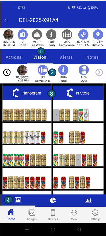
Vision
The Vision tab offers a comprehensive visual comparison between the expected planogram and the actual in-store shelf setup. This section helps verify product placement accuracy, monitor planogram compliance, and assess key performance indicators (KPIs) such as purity and SOVI.
Below are the main sections available within the Vision tab, each designed to provide actionable insights and visual clarity:
1. Vision
Highlights the currently active tab, presenting visual data such as the planogram layout and in-store shelf images. This section serves as the entry point for visual analysis.
2. Image KPIs
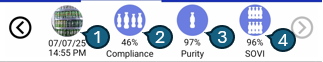
Displays essential image-based metrics, including capture date and time, compliance status, purity percentage, and SOVI (Share of Visual Inventory) score. These KPIs help assess shelf execution quality at a glance.
1. Current Image
Shows the most recent image captured for the asset with date and time.
2. Compliance (%)
Planogram Compliance checks how well the instore product placement matches the defined planogram. It reflects whether the products are placed in the right positions within the chiller.
3. Purity (%)
Purity measures the percentage of a client's products present in a chiller or cabinet. If any competitor (foreign) products are detected, it reduces the purity score. A high purity score means the cabinet is mostly or entirely filled with the client’s products.
4. SOVI (%)
Share of Visual Inventory (SOVI) refers to the real-time availability of products inside a cabinet or chiller.
5. Previous / Next Image
By tapping the Previous Image button, you can view the earlier image captured for the asset, along with its corresponding date and time. This feature allows you to compare changes over time and track shelf execution history. Similarly, the Next Image button lets you view the next image captured for the asset and its corresponding date and time.
3. Planogram vs Store
Offers a side-by-side comparison between the expected planogram arrangement and the actual in-store shelf setup. This section makes it easy to spot discrepancies and ensure planogram compliance.
4. Chart Navigation
Enables users to switch between different chart types—such as pie and bar charts—for a detailed, product-level visual analysis of compliance and stock levels.
Pie Chart
This screen presents a Pie Chart that visually compares planogram vs in-store data using product-level segmentation.
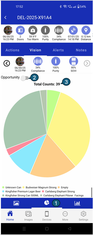
1. Chart Navigation:
Use these controls to toggle between the pie chart and bar chart views. The currently selected chart type is highlighted, making it easy to switch your visual analysis mode.
2. Opportunity Toggle:
This switch lets you alternate between viewing In-Store data (toggle set to false) and Planogram data (toggle set to true). This helps you quickly compare in-store conditions with the planogram data.
3. Total Counts:
Displays the total number of product facings for the selected view. For example, if the pie chart is showing In-Store data, this number reflects the total facings counted in-store (e.g., 39). This provides a quick summary of product presence.
Bar Chart
This screen displays a Bar Chart to help you compare the expected product layout (planogram) versus the actual in-store stock. This visual format allows for quick identification of product gaps or overstocking.
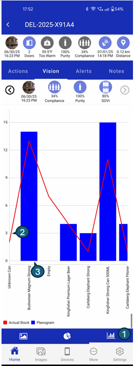
1. Bar chart Navigation
Indicates that the bar chart is currently selected. Tap to switch back to the pie chart.
2. Blue Bars (Planogram)
Represent the expected quantity (facings) for each product as per the defined planogram.
3. Red Line (Actual Stock)
Displays the actual stock counts recorded in-store. Helps identify deviations from the planogram.